
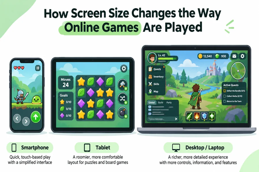
Online games can have a different experience and feel on a tablet, a desktop and a smartphone. Before, a board game that fills a laptop screen is typically resized or compressed on a mobile phone. Game controls that work with a mouse might frustrate players who use their thumb for the same game on their tablets or mobile phones.
Screen dimensions among these devices influence the player’s experience. By this, we mean what players can see, how they navigate the game and how comfortably they can play on various devices. Even a well-made game can struggle when its interface has too little space.
Why Smaller Screens Change Game Controls
Smaller screens can affect game controls because players need to see much of the game, but still have enough screen space to touch its controls. For example, a puzzle game needs a playing grid, a score, a timer and a restart button among other controls. Shrinking these controls and the grid will make the game harder to play.
Due to the nature of modern smartphones, touch controls make spacing very important. The minimum target size set by the World Wide Web Consortium’s accessibility guidance is 24 by 24 CSS pixels for pointer inputs, with specified exceptions.
However, Google’s Android accessibility advice recommends touch targets of at least 48 by 48 density-independent pixels. However, these measurements are not interchangeable. This is because both sizes cover the same problem: small, crowded controls lead to inaccurate taps.
Excellent mobile game designs take many things into consideration, like navigation, speed, and most importantly, the space the player’s finger occupies.
How Online Games Adapt to Phones and Computers
Game designers typically rearrange various information for different devices and screen sizes instead of just reducing everything or shrinking it. For example, a desktop version might show settings, playing area and score together, while on mobile devices, secondary gaming information might be moved to the menu.
Let’s use browser-based social casino games as another good example. Baba Casino has slot-style games mixed with social and sweepstakes play options. The social casino platform is accessible for desktop and mobile users, offering a unique experience no matter the device you’re playing on.
Platforms like the one mentioned above are where different device sizes and layouts shape the experience of a player. Each layout will have to contain balance information, game reels, game navigation, among others. Its broader design principle applies to various games like digital board games, trivia, card games, puzzles, etc. Following this principle ensures that important game information is readable and usable without forcing players to switch layouts, views or even try to zoom in.
Why Screen Size Is Not the Same as Resolution
Screen size is not resolution, and this means that a smartphone can possess a sharp display, but still offers little room for game controls. Mobile resolution covers a number of pixels on a device screen, while the size is the diagonal measure of the screen’s physical size.
Another important factor about mobile games that enhances or depletes user experience when playing games is Aspect ratio. To put it clearly, a tall smartphone screen is suitable for vertically arranged menus, while a wide monitor has more room for a landscape playing field.
For example, turning a phone sideways can help with racing games or virtual boards, but it may also leave less vertical space for instructions and controls.
What Tablets Add to the Gaming Experience
Tablets occupy a unique middle position in the device industry. They have larger screens, which cater for a substantial playing area without making the controls feel crowded.
Using a strategy game built for tablet devices, for example, players might check or expand its map, while a digital board game might need enough screen room for players to move pieces without covering adjacent spaces.
Tablet devices enhance the experience for games that once needed a physical table. A good example would be the Ludo game moved from a physical game to a screen. This digital approach affects how the gameplay changes, turns are taken, pieces are moved, and shared information is managed. A tablet can present these gaming elements together, while a mobile phone may need a simpler arrangement.
However, don’t get it twisted, a larger touch screen does not automatically mean better. Some users might find it uncomfortable playing games on their tablet for a long session, and if controls are placed at the far edge of the screen, it can be very uncomfortable to use often.
The Best Screen Depends on the Game
Quick puzzle rounds and simple touch-based games often work well on a phone. Strategy games, detailed boards and interfaces with several active panels may benefit from a tablet or monitor. Players who prefer short sessions away from a desk will judge convenience differently from those who spend hours playing at home.
The useful question is therefore not which device has the biggest display. It is whether the game uses the available space well: controls are easy to reach, information stays legible, and the playing area remains clear. Those details determine whether changing screens feels natural or turns a familiar game into a struggle.

Hi, I’m Tony — a passionate blogger with over 3 years of experience in writing informative and accurate content. I specialize in sharing practical insights on sizes, measurements, and spatial guides to help readers make confident decisions. Through DimensionsPoint.com, I aim to simplify complex data into easy-to-understand content that’s reliable, useful, and SEO-friendly.
When I’m not writing, I’m researching the latest trends in measurement standards and user needs to keep my content relevant and up to date.