
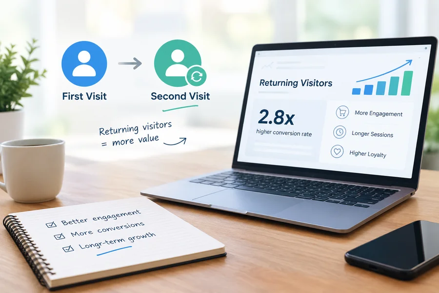
Most websites are designed around an imaginary moment.
A potential customer arrives for the first time, reads the homepage, understands the offer, becomes convinced and immediately contacts the business.
It is a wonderfully simple journey.
It is also not how many considered purchases happen.
A prospective customer may discover a company during lunch, browse two pages and leave. Later that evening, they search for the company again. A few days later, they return after discussing the purchase with a colleague or partner. They might compare the business with two competitors before finally coming back to request a quote.
By the time they convert, the website has been visited several times.
Yet businesses often optimise every visit as though the person has never seen them before.
This creates an interesting opportunity: what would a website look like if it were designed for the second visit rather than only the first?
The First Visit Is Often Just an Introduction
When someone first discovers a business, they may not be ready to make a decision.
They could simply be establishing what options exist.
A Boston homeowner researching a major renovation might initially compare contractors, browse project galleries and develop a rough understanding of costs. A company looking for a software partner may spend considerably longer examining capabilities, case studies and competing providers.
In these situations, expecting an immediate enquiry can be unrealistic.
The first visit may have another job.
It introduces the company.
If the visitor leaves remembering the brand, understanding what it does and having a reason to return, that visit may have accomplished something valuable even without producing a conversion.
This changes how businesses should think about website performance.
Returning Visitors Arrive With a Different Question
A first-time visitor often asks:
“Who are you?”
A returning visitor is more likely to ask:
“Why should I choose you?”
Those questions require different information.
The homepage may be perfectly capable of explaining the business, but someone returning after comparing alternatives may no longer need another introduction.
They may want evidence.
They could be looking for pricing guidance, previous work, testimonials, technical capabilities, delivery processes or answers to a specific concern discovered during their research.
The website therefore needs enough depth to support progression rather than repeatedly presenting the same introductory sales message.
Think of the Website as a Memory System
Websites are normally discussed as information systems or conversion tools.
There is another useful way to think about them.
A website is also a memory system.
After a visitor closes the browser, what remains?
Perhaps they remember an unusual project.
Maybe they remember a clear explanation of a difficult problem. They might recall a useful comparison, a distinctive visual identity or a particularly convincing customer story.
If nothing remains, the business becomes one of several nearly identical browser tabs.
This makes memorability a legitimate design consideration.
A site doesn’t need unusual animations or visual tricks to become memorable. Specificity is often enough.
“We help businesses grow” is forgettable.
A detailed example showing how the company solved an unusual customer problem is much harder to confuse with a competitor.
Build Recognition Before Persuasion
Businesses understandably want websites to persuade visitors.
But persuasion becomes harder if visitors cannot remember which company said what.
Recognition therefore deserves attention.
Consistent typography, imagery, messaging and brand language can help returning visitors immediately recognise that they have reached the same company they previously researched.
This is especially important in competitive service markets where several websites can appear remarkably similar.
If five providers use similar layouts, generic stock photography and interchangeable claims about quality and customer service, the visitor may struggle to distinguish them later.
Good design can reduce that confusion by giving the business a coherent visual and verbal identity.
Give Visitors Something Worth Returning For
A website designed for repeat consideration needs more than service descriptions.
It needs return assets.
A return asset is information useful enough that a potential customer has a reason to revisit the website.
For a financial services company, this might be a detailed calculator or comparison guide. For a builder, it could be a project gallery explaining budgets, constraints and solutions. A B2B technology company might provide implementation guides, technical comparisons or detailed case studies.
These resources serve a different purpose from ordinary lead-generation pages.
They create a reason for the website to remain part of the customer’s decision process.
Instead of hoping that every visitor converts immediately, the business gives undecided visitors somewhere useful to return.
Design for the Comparison Visit
One of the most commercially important visits may happen after a prospect has opened several competitors in different tabs.
At this point, the website isn’t being evaluated in isolation.
Everything is comparative.
Which company explains the service most clearly?
Which appears to have relevant experience?
Who provides evidence rather than claims?
Which website makes the next step easiest to understand?
This is where generic messaging becomes particularly weak.
If every competitor claims to be experienced, customer-focused and results-driven, those statements provide very little help to someone trying to make a decision.
Specific information becomes more valuable.
Explain how projects actually work. Show relevant examples. Discuss limitations. Introduce the people responsible for delivery. Answer difficult questions instead of only easy ones.
The comparison visit rewards substance.
Make Previous Exploration Easier to Reconstruct
Returning visitors frequently need to find something they saw earlier.
Perhaps they remember reading a particular service page but cannot recall its name. Maybe they want to show a colleague a case study or return to information about a specific solution.
A confusing website structure makes that difficult.
Clear navigation, descriptive page names and logical content groupings help visitors reconstruct their previous journey without remembering the exact URL.
This is one reason information architecture matters beyond SEO.
The structure of a website should help people understand how services, industries, resources and proof relate to one another.
For businesses considering Website design Boston, the design conversation can therefore go beyond appearance and first-visit conversion rates. A useful website also needs to support people who return with greater knowledge, stronger intent and more specific questions.
Marketing Should Prepare for the Return Journey
The second-visit concept also changes how marketing channels are viewed.
Search, paid media, social platforms, email and direct traffic don’t necessarily represent independent groups of customers.
The same person can move between them.
A prospect might initially discover a company through an advertisement, return through organic search and finally visit directly after remembering the brand name.
If each channel is evaluated only according to the conversion that happened during its own session, some of the journey can become difficult to see.
Marketing strategy therefore benefits from asking not only which channel generated the final enquiry, but which interactions helped the customer progress towards it.
This is particularly relevant when planning Digital Marketing Services Boston, because SEO, paid advertising, content and website experience can play different roles at different stages of the same buying process rather than competing to claim the entire customer journey.
Create Content for Increasing Levels of Intent
A website can be structured around how customer questions change as confidence grows.
At the beginning of research, someone may ask broad questions about a problem.
Later, they begin investigating available solutions.
Eventually, their questions become more commercial. They want to understand cost, timelines, differences between providers, risks and what happens after they make contact.
A strong website contains useful information at each stage.
The objective isn’t to force every visitor directly towards a contact form. It is to make sure that when their questions become more specific, the website continues to have useful answers.
That creates a natural progression from discovery to evaluation.
The Third Visit May Need More Proof Than More Content
Suppose someone has visited three times without enquiring.
Publishing another introductory article may do very little to move them forward.
Their hesitation could be caused by something else.
Perhaps they haven’t seen enough evidence of relevant experience. Maybe pricing remains too uncertain. They could be worried about the process, contract terms or what happens after the initial consultation.
Businesses can learn from these repeated objections.
Sales conversations, enquiry emails and customer feedback can reveal what people need immediately before making a decision.
Those insights can then become website content.
In this way, sales questions become design requirements.
Mobile Visits and Desktop Decisions Can Have Different Jobs
Another interesting consideration is that repeat research can happen across different devices.
Someone may first discover a business on their phone while commuting and later investigate it properly from a laptop. Another customer might conduct most research on desktop before returning from mobile when they are ready to call.
The experience should therefore remain coherent across devices.
Important proof shouldn’t disappear on smaller screens. Calls to action should remain accessible, while navigation should allow returning visitors to quickly reach deeper information.
Responsive design isn’t only about making a layout fit different screen sizes.
It is about preserving the decision journey when the context of the visit changes.
Stop Treating Every Exit as Failure
A visitor leaving without converting is usually interpreted negatively.
Sometimes that interpretation is correct.
Perhaps the page was irrelevant, slow or confusing.
But departure can also be a normal part of consideration.
A visitor may leave because they need approval, want to compare providers or simply aren’t ready to make a decision.
This means an exit and a rejection aren’t always the same event.
The more considered the purchase, the more important this distinction becomes.
Instead of trying to prevent every visitor from leaving, businesses can ask whether they have given promising visitors enough reason to come back.
Measure Return Behaviour
Traditional website reporting often concentrates heavily on sessions, users, conversions and channel performance.
Businesses can add another layer by examining what happens across repeated interactions where their analytics setup and privacy choices allow it.
Do returning visitors engage with different pages? Are they more likely to view case studies? Which pages frequently appear before enquiries? Do prospects revisit particular resources during longer buying journeys?
These patterns can help identify content that contributes to consideration even when it isn’t the page where the final conversion happens.
A case study with relatively modest traffic, for example, could be disproportionately important to people who eventually enquire.
Traffic volume alone wouldn’t reveal that role.
Build for the Visitor Who Already Knows Your Name
Most websites have to serve multiple audiences simultaneously.
They need to make sense to someone who has never heard of the company while remaining useful to someone who has already researched it three times.
That is difficult, but it creates a better design objective than simply trying to make every page convert immediately.
The first visit can create understanding.
The second can build preference.
The third may provide reassurance.
A later visit might finally produce action.
Not every customer will follow that sequence, and some will convert immediately. The point is not to manufacture a longer journey.
It is to avoid designing as though longer journeys don’t exist.
The next time a website is reviewed, it may therefore be worth temporarily ignoring the imaginary first-time visitor.
Open the homepage and pretend you have already seen it.
You already know what the company does. You have looked at three competitors. You aren’t searching for another sales pitch.
You are asking one question:
“Give me a reason to come back to this company.”
What the website offers next could be more important than what it said during the first visit.

Hi, I’m Tony — a passionate blogger with over 3 years of experience in writing informative and accurate content. I specialize in sharing practical insights on sizes, measurements, and spatial guides to help readers make confident decisions. Through DimensionsPoint.com, I aim to simplify complex data into easy-to-understand content that’s reliable, useful, and SEO-friendly.
When I’m not writing, I’m researching the latest trends in measurement standards and user needs to keep my content relevant and up to date.